
9 Rules of Pattern Mixing and Color Palettes—and How They Relate
Pattern mixing and color palettes shape a home that feels thoughtfully designed—not loud, but layered and refined. Trends come and go, but at Oliver James, we focus on what feels lasting and considered. Our goal is always a space that feels graceful, grounded, and personal. When done right, patterns and colors work hand-in-hand to create interiors that feel lived-in and loved, not chaotic.
Let's break down how we approach this delicate dance.
Start with Your Foundation: Color First
Every successful room begins with a clear vision, and more often than not, that starts with your color palette. You might be inspired by a dreamy fabric that instantly feels like the heart of the space—we call that a "hero fabric." It's usually the boldest pattern in the room, the one that sets the tone for everything else. From there, your palette unfolds.
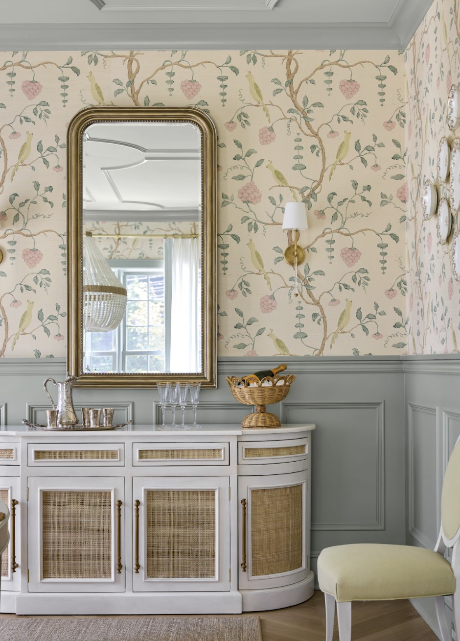
At Oliver James, we tend to gravitate toward soft, grounded tones: earthy greens, powdery blues, natural linens, and warm, desaturated hues. These colors aren’t just pretty—they create a gentle backdrop that allows patterns to shine without overwhelming the space.
Patterns Should Play Supporting Roles
When it comes to prints, the goal is never to be matchy-matchy, but it’s also not about throwing every bold fabric you love into one room. Instead, think of each pattern as a supporting character—some are main characters, yes, but most are there to gently guide the story along.
Use one or two large-scale patterns to make a statement—perhaps a painterly floral or a wide stripe. Then add in smaller, more delicate motifs to bring in depth and contrast. The key is that all patterns should speak the same language, either through a shared color or tone. It’s less about being identical and more about feeling related.
Scale is Your Secret Weapon
This is where things get interesting. One of the most common mistakes in pattern mixing is using prints that are all the same size. That’s when a room starts to feel busy. Instead, vary the scale. Try layering a large botanical with a medium gingham and a tiny ticking stripe. Suddenly, the room has rhythm and movement, without shouting.

Don't Forget: Texture is a Pattern Too
Not all patterns come from prints. A nubby linen, a chunky boucle, even a raw silk can offer just as much visual interest. In fact, in many of our projects, texture is the quieter hero. It adds softness, dimension, and warmth without demanding attention.
This is especially helpful in rooms where you want a calm, layered look but don’t want to go overboard with prints. A beautifully woven textile can do wonders.
Give Your Eyes a Place to Rest
Just as important as what you include is what you leave out. Every space needs visual breathing room. Not every pillow, curtain, or rug needs to have a pattern. In fact, solids in thoughtful textures are often what give a space that serene, curated feel.
This is where restraint really shows its power. When everything is patterned, nothing stands out. But when you know where to pause, your statement pieces truly shine.
Neutrals Can Be Deeply Layered
One common misconception is that neutral spaces are boring. This is simply not true. Warm whites, soft oatmeals, pale greys, and powdery blues can be mixed and layered in such elegant, nuanced ways. When combined with different textures and subtle patterns, neutrals can be incredibly dynamic. It’s all in the details.

Edit, Then Edit Again
Editing is what transforms a room from good to great. After you’ve made your selections, take a step back. Live with them for a few days. See how they feel in the light. More often than not, one piece will stand out—either because it belongs or because it doesn't.
If it feels off, trust your eye. But also trust your joy. If a particular combination makes you smile every time you walk past, that might be reason enough to keep it.
Let Your Home Guide You
Not every pattern belongs in every house. A quiet, historic home might call for softer, timeless prints—like ticking stripes, delicate florals, or classic block prints. Forcing something overly trendy into a space that deserves something enduring can throw off the balance.
Design is about harmony, and your architecture should have a say in the story.

Color and Pattern are a Partnership
Neither can do all the heavy lifting alone. Your color palette keeps the patterns from feeling busy. Your patterns prevent the palette from feeling flat. Together, they create something beautiful—a room that feels layered, intentional, and quietly stunning.
Color and Pattern: A Quiet Conversation
When done well, color and pattern don’t compete—they speak to one another. A balanced palette brings calm to the mix, while layered prints add depth and movement. The goal isn’t perfection; it’s harmony. It’s the kind of subtle, thoughtful pairing that makes a space feel lived-in and loved, curated yet deeply personal.
This post was all about the best ways to mix patterns and build color palettes with grace, intention, and timeless charm.